Creating the brand identity and user interface screens for a mental health tracking app for u-m students

My Role
Graphic Designer
Coursework
SI 520 -
Graphic Design and Visual Communication
Methods
Wireframing
Design systems
Component library
UI Design
Logo Design
Tools
Adobe Photoshop
Adobe Illustrator
Figma
Timeline
3 weeks
This project was part of my Graphic Design & Visual Communication course. The brief called for a digital resource to support student mental health, a mood tracking app that would serve as a non-judgmental companion for students navigating the unique stressors of college life.
Design a complete brand identity system for a student wellness app
Create an approachable, supportive brand personality aligned with U-M's institutional brand
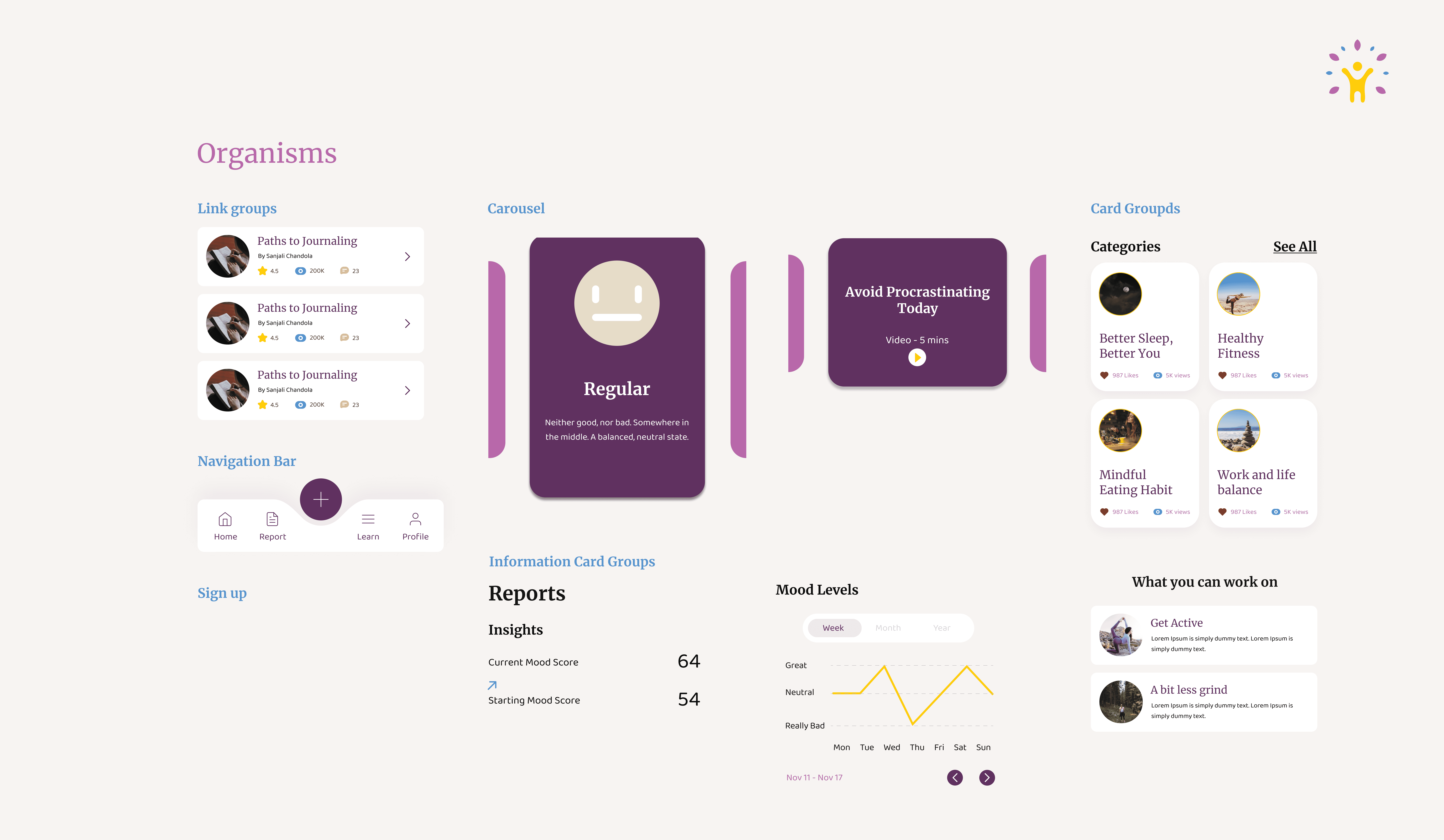
Develop high-fidelity mobile app mockups that encourage daily emotional check-ins
Establish a visual language that reduces stigma around mental health
University of Michigan students experiencing academic pressure, social challenges, and the general stresses of college life. The design needed to feel accessible rather than clinical, encouraging regular engagement without feeling like another obligation.
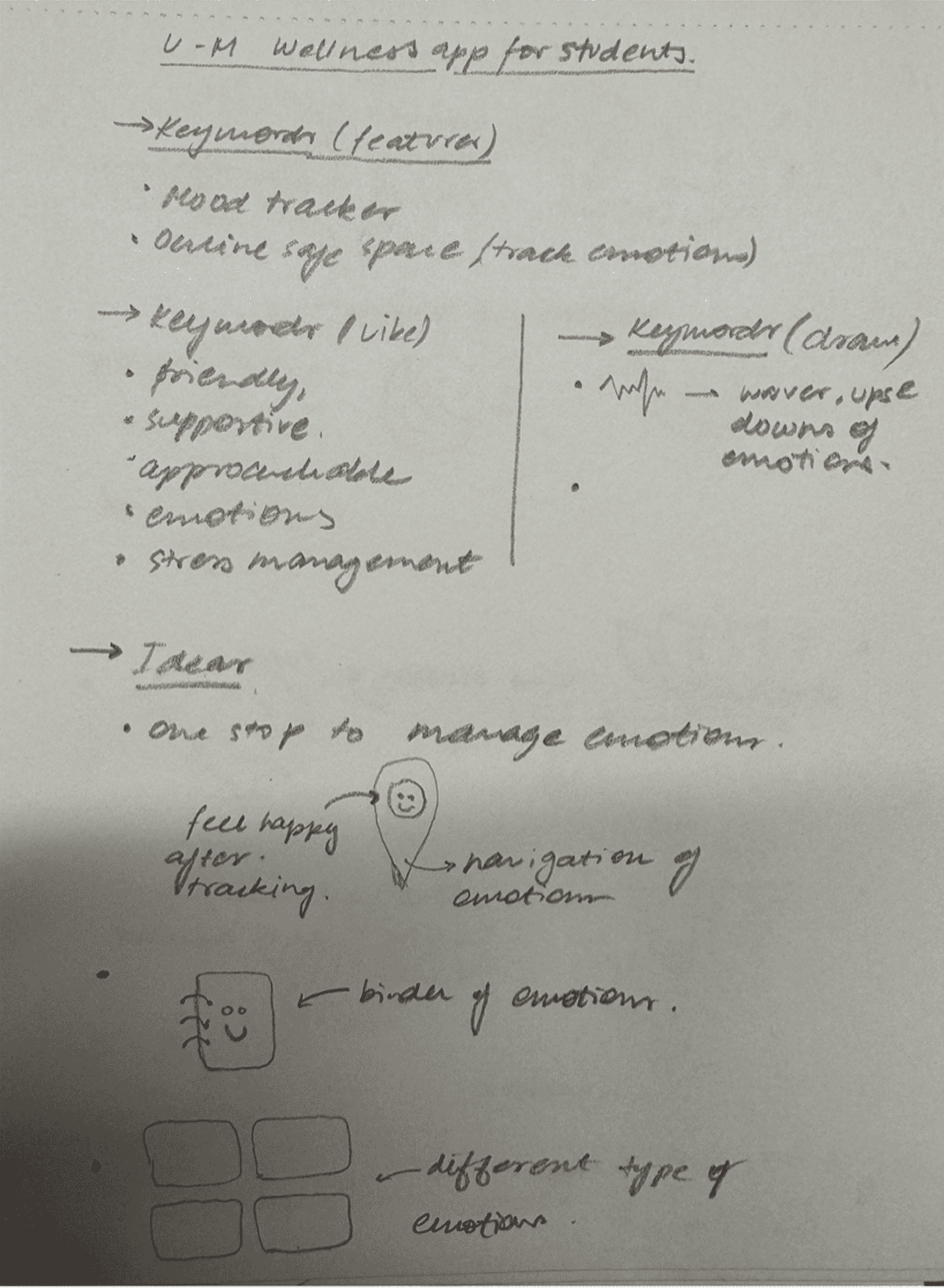
I analyzed the landscape of existing mood tracking applications to identify design patterns and opportunities for differentiation, and how they communicate their message through their logos

Key Insights


Must coordinate with UM's official brand guidelines
Needs to work across digital and print applications
Should feel institutional enough to be trustworthy, but approachable enough for daily use
Must be scalable from app icons to campus promotional materials
I explored two naming directions:
BlueMind - Selected for its dual meaning referencing both the University's iconic blue and a positive state of mind. The name is memorable, optimistic, and clearly communicates the app's purpose while maintaining UM affiliation.
Mwell (Alternative) - Combines "M" (Michigan) with "well" (wellness), though less evocative than BlueMind.

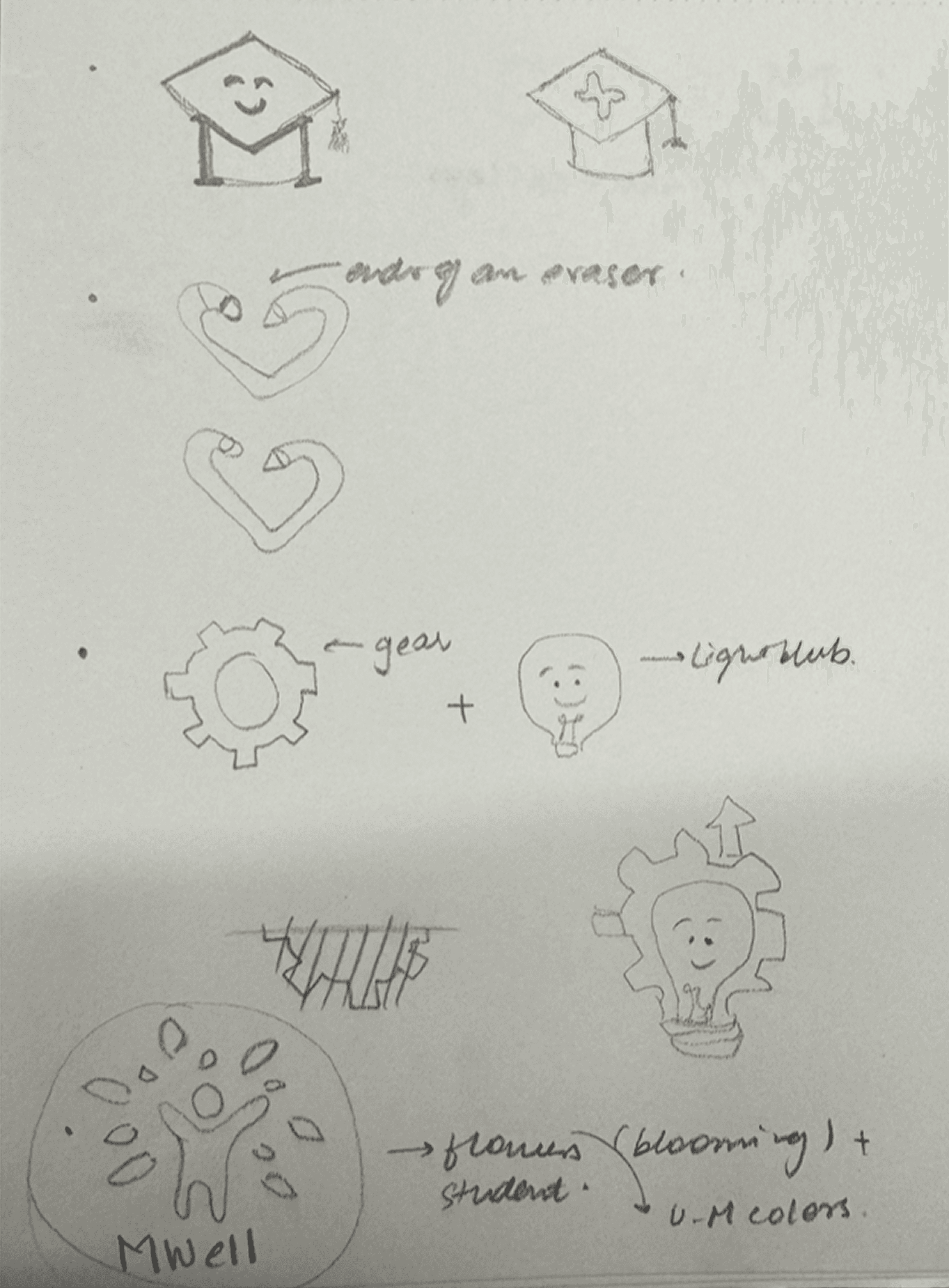

I began with 5-6 detailed sketches exploring different symbolic directions:
Flower/bloom metaphors for growth
Head/brain abstractions for mental wellness
Connection symbols for community support
Upward/growth directional elements
Selected logo: The figure surrounded by radiating petals

The final BlueMind logo symbolizes student growth and emotional well-being through a central figure representing a student, surrounded by radiating petals evoking a blooming flower. This metaphor communicates:

I've paired Montserrat, a sans-serif, with Merriweather, a serif, to balance professionalism with approachability. Montserrat's clean geometric forms establish BlueMind's credibility as an institutional UM resource, while Merriweather's serifs make body text feel supportive. This sans-serif/serif pairing creates natural visual hierarchy, allowing each typeface to serve a distinct functional role while maintaining cohesive brand warmth.

I built the palette directly from UM's brand identity guidelines, ensuring institutional coordination while creating an emotional language for the app. This palette balances UM brand loyalty with psychological color theory for wellness applications. The vibrant maize prevents the app from feeling too serious, while the purples add credibility and calm.

I developed four core variations to ensure flexibility across applications. Each variation maintains the same visual weight and brand recognition. The mark is designed to work independently, crucial for app icon recognition

For each logo variation, there's a minimum size specification to ensure text remains legible, the figure and petal details stay recognizable, print reproduction maintains quality, and the logo appears sharp across all digital resolutions

I used a modular system where x = 1/3 the width of the logotype to establish mandatory clear space around all logo variations. This helped prevent visual clutter, ensuring the logo maintains its impact. It also helped in creating consistent brand presentation across all touchpoints and protecting legibility.

I created four essential color treatments to ensure versatility:
CMYK on white background - Standard color application for most use cases
CMYK adjusted for black background - Modified saturation and brightness to maintain vibrancy on dark surfaces, crucial for dark mode app interfaces
Black only on white - Single-color reproduction for cost-effective printing (student handouts, photocopies)
White only on black - Reversed treatment for dark backgrounds, maintaining shape recognition without color
These variations ensure the logo works in any medium while maintaining brand integrity. The adjustments for dark backgrounds were particularly important given the prevalence of dark mode in mobile apps.

I curated 8 photography assets that tell a cohesive story about student wellness, establishing visual guidelines for future content

I created two practical applications demonstrating logo scalability. These applications prove the identity system works beyond digital, important for campus awareness campaigns and student outreach events.
Variation 1: Compact mark at 0.5 inches on left chest with "BlueMind" logotype
Variation 2: Full mark with tagline at 1 inch on center chest